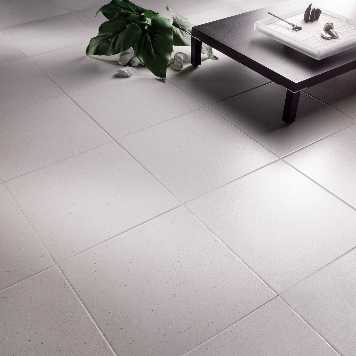
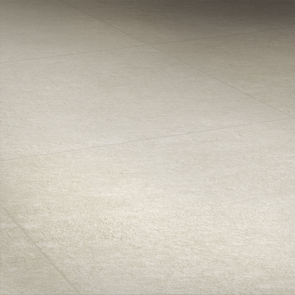
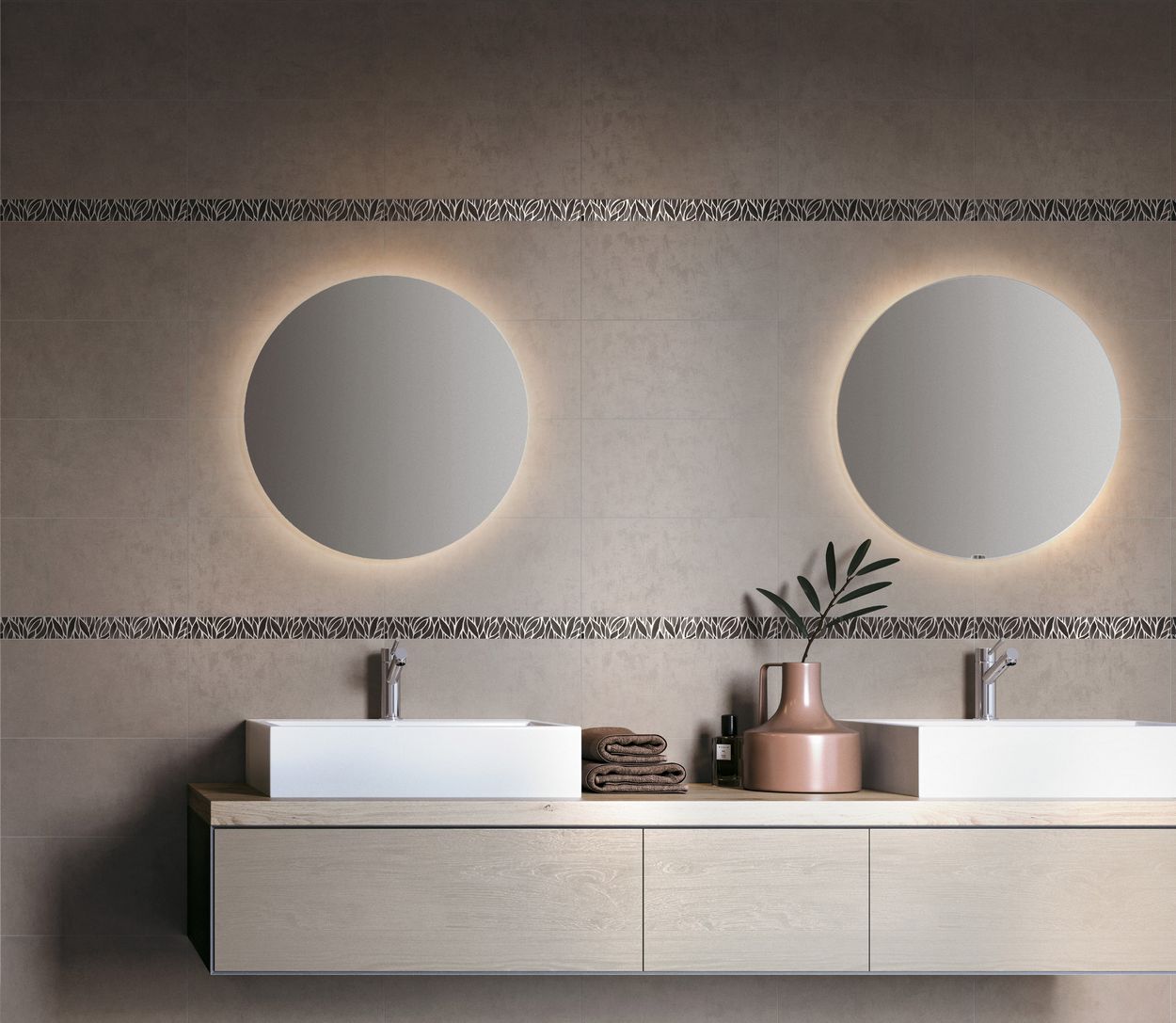
White tiles reflect light in a pleasing way and guarantee a brighter floor than any other colour. White ensures a well-defined sense of space and makes the room seem larger. This ever up-to-date colour appears in various shades, warmer or cooler, in many Novoceram series. At times it is even enhanced by applications of reflective or satin-finish materials that multiply the reflections. If a matt surface symbolises and recalls purity, shiny white is associated with the refinement and elegance of contemporary decoration.
💬
×
Novobot

White Tiles
Our white tile collections


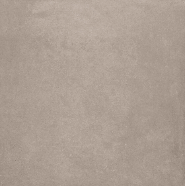



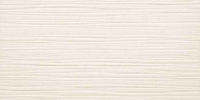




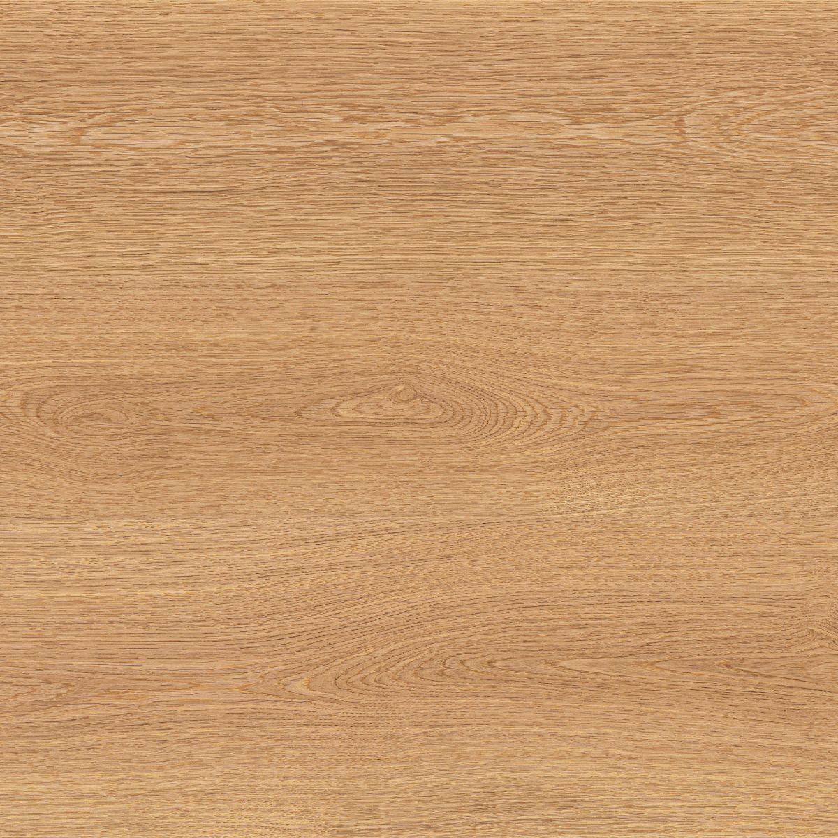
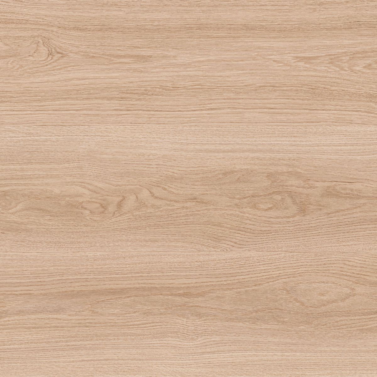

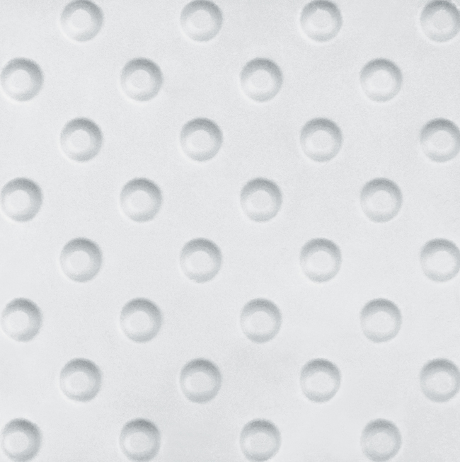
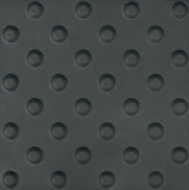
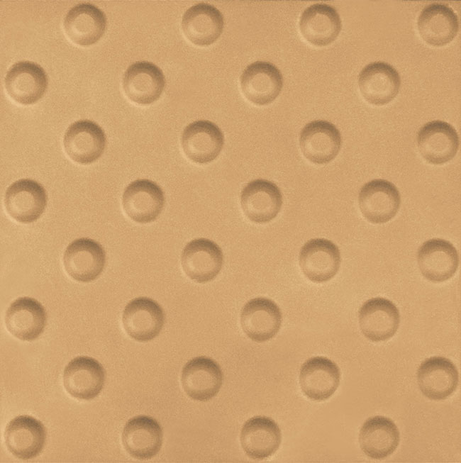

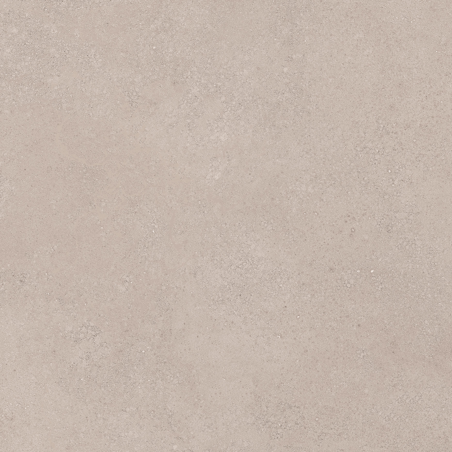
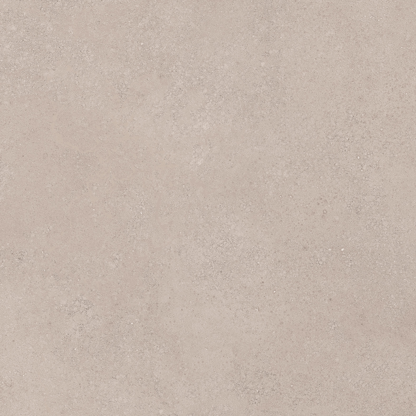
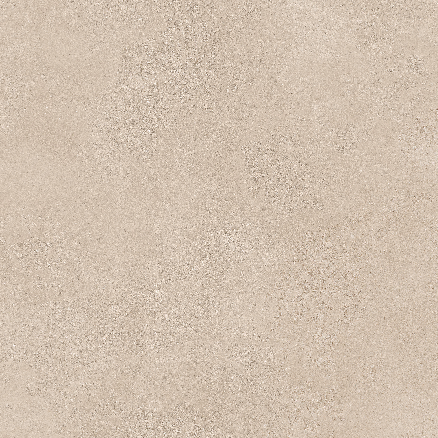

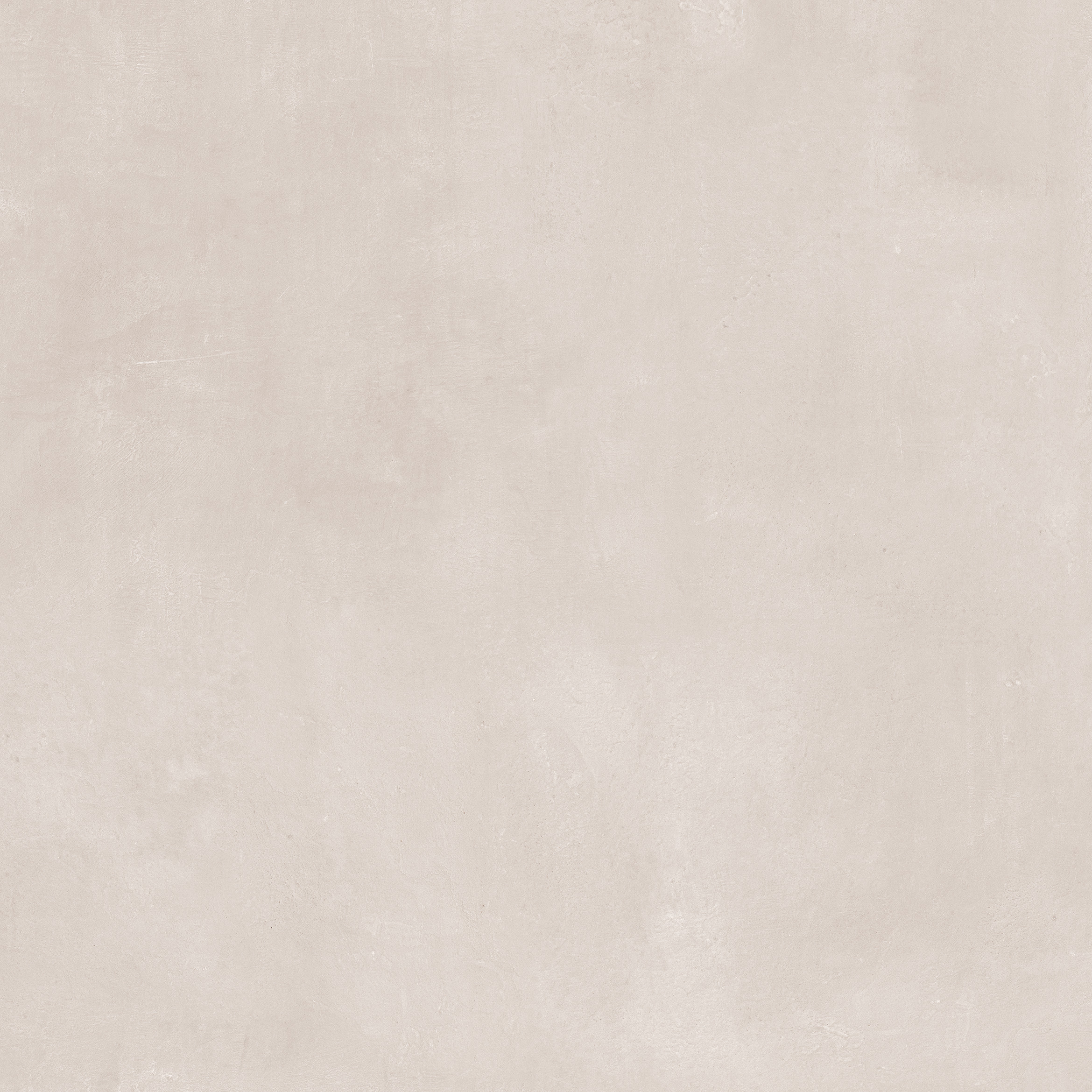


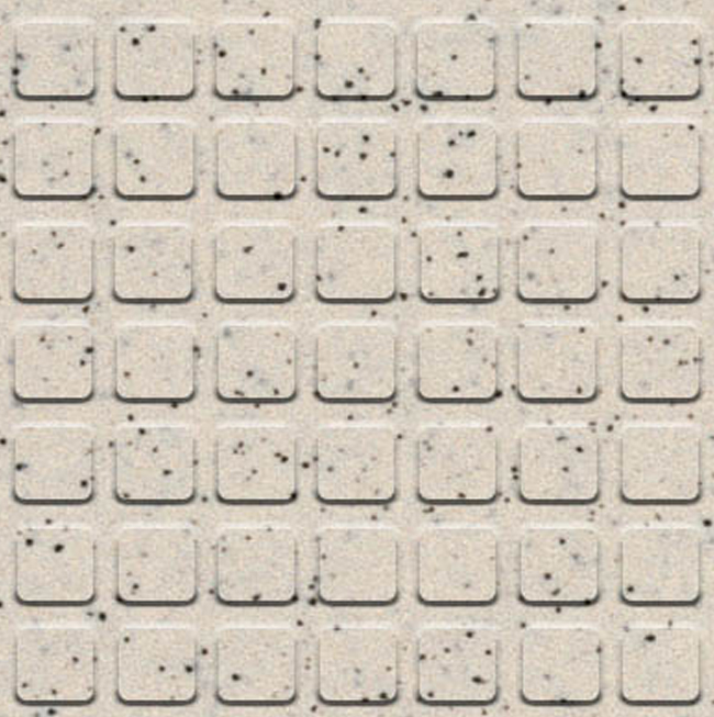

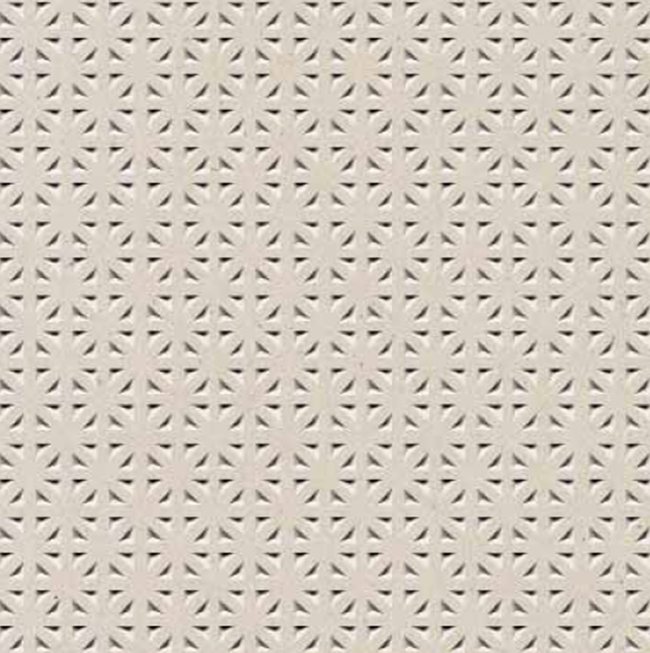

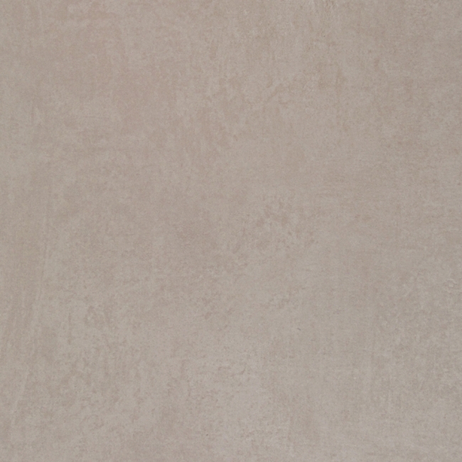
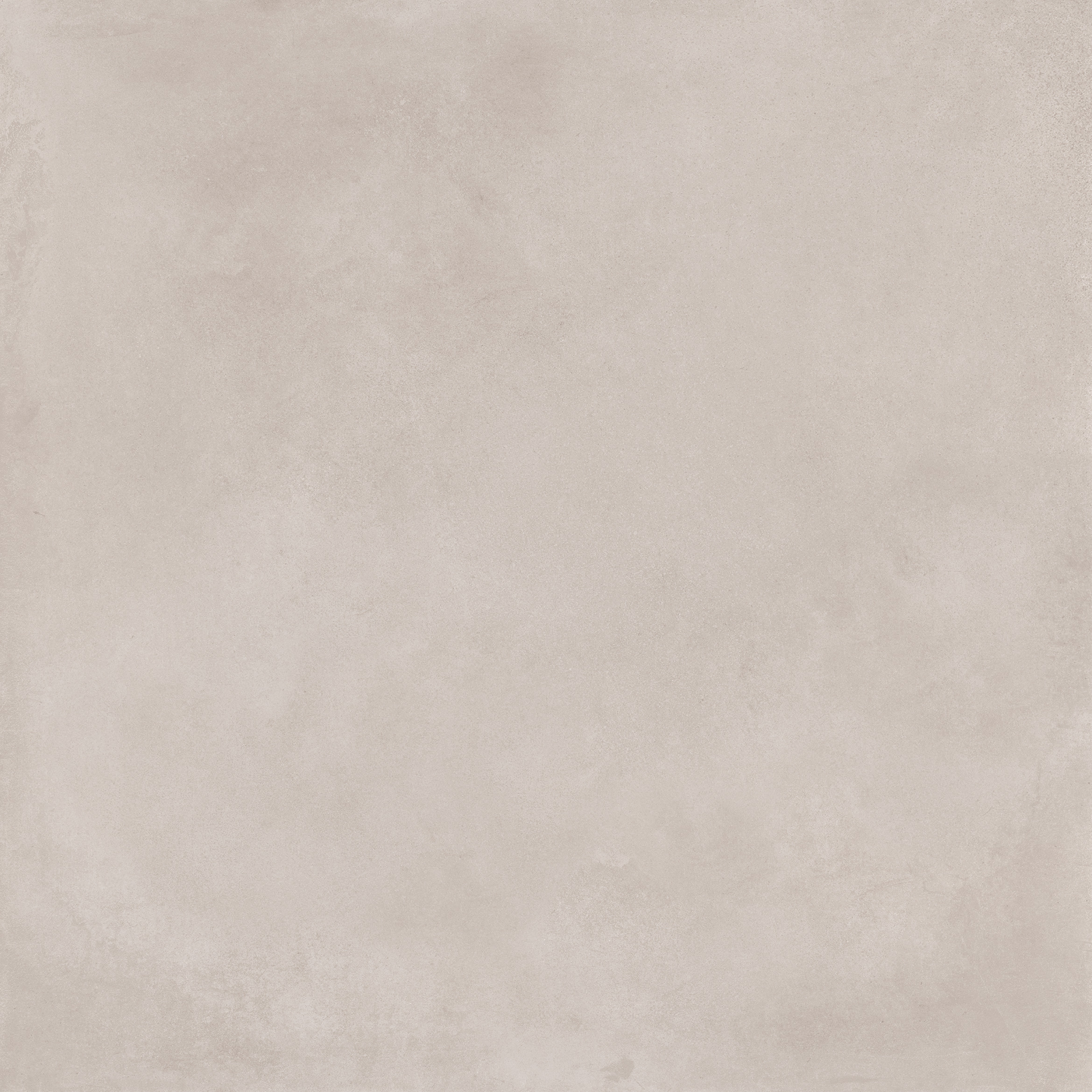


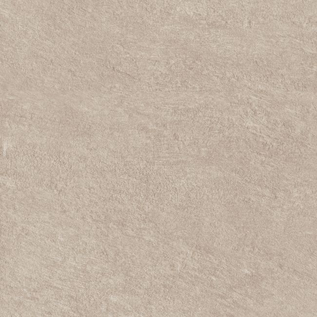
- 30x30 cm - R11, A+B
- 30x60 cm - R11, A+B
- 45x45 cm - R11, A+B
- 60x60 cm - R11, A+B

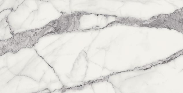
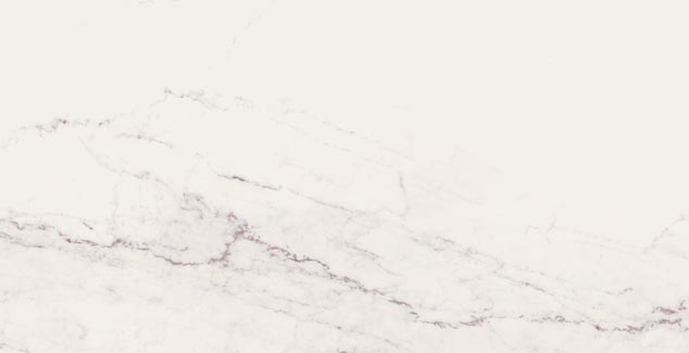

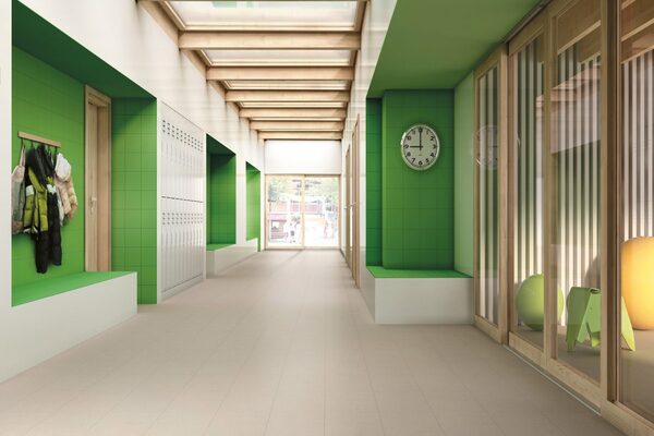
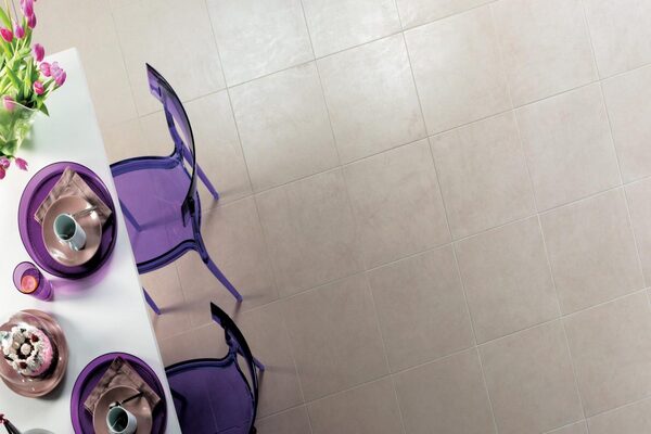
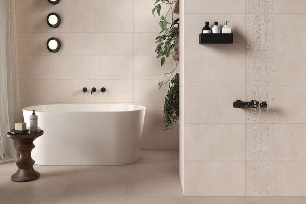
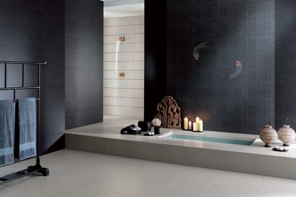
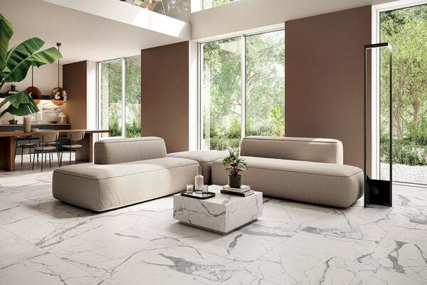
The aesthetic effects of white tiles
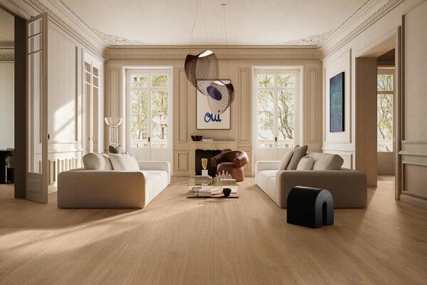
The strong point of white tiles is that beyond its immaculate colour, it adds character to spaces, particularly through the different aesthetic aspects in which it can be declined. The vibrant colour of white tiles combined with the aesthetic effect it presents can give rise to environments with a singular style.
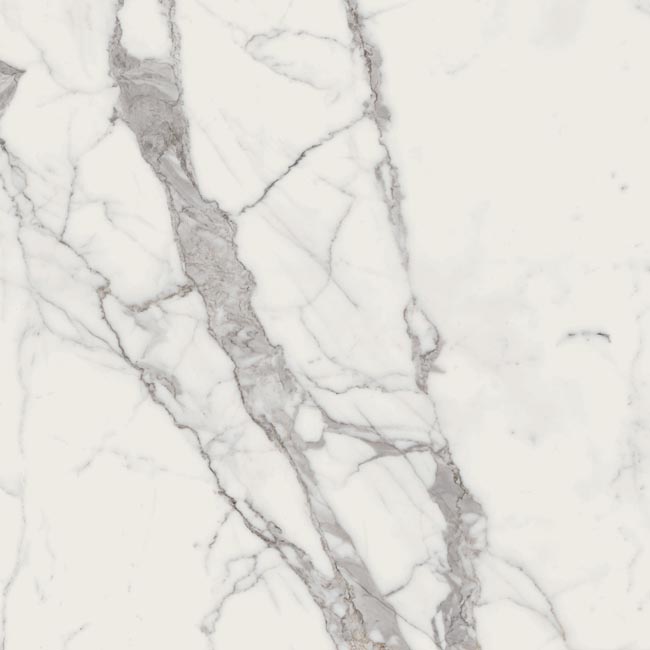
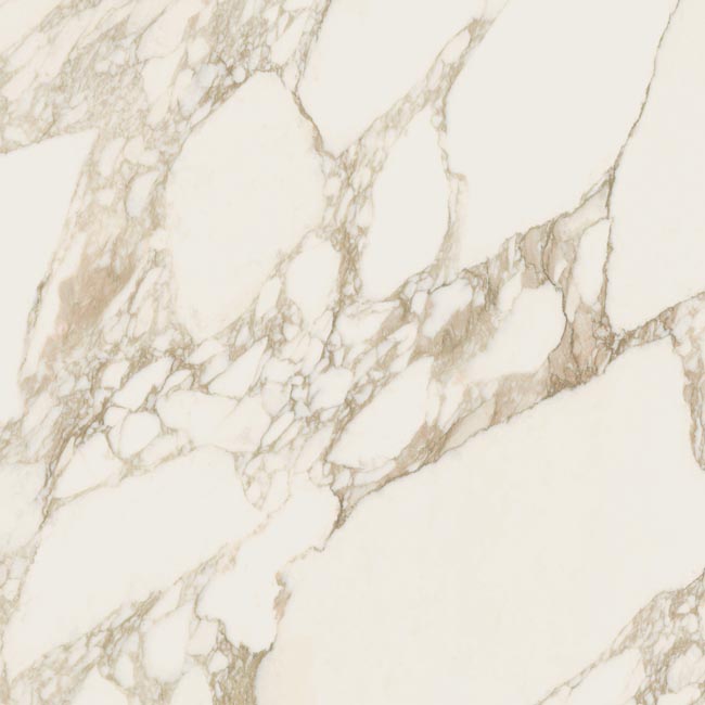
Firstly, white sandstone reproduces certain natural materials such as stone with stunning precision. Thanks to technological advances, it is now possible to reproduce even the most minute details that characterise the identity and natural beauty of stone, such as the veins and roughness that enrich the surface of tiles. In this case, the charm of stone combined with the purity of white porcelain stoneware tiles offers a result that evokes nature in all its nobility and finesse. The spaces that welcome this gentle combination release an indefinable elegance into the atmosphere.
Then, white porcelain stoneware replicates the effects of metal for a more modern and contemporary result. This combination of white and the modernity of metal celebrates light like no other, especially when mixed with other decorative elements typical of industrial décor, such as raw materials or contrasting colours and textures. White tiles play an essential role in defining the space, while adding a trendy touch thanks to the metal effect.
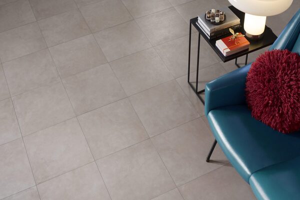
White tiles also have the aesthetic appeal of resin-effect tiles. This ultra-modern combination will suit any décor, from the most contemporary to the most traditional. White resin-effect stoneware reproduces the smooth, supple look of resin, unifying and harmonising any space. This deceptively neutral base is the ideal framework on which to base the style of the space, simply because of its simplicity and versatility.
Finally, white porcelain stoneware can take on design appearances and is particularly suited to spaces with a contemporary, clean style, which is thus delicately enhanced by the light of white porcelain stoneware tiles. However, modern tiles can also be laid in more rustic or traditional styles to create an interesting play of contrasts from a decorative point of view.
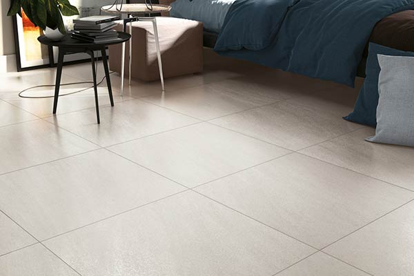
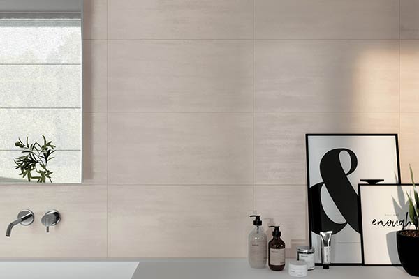
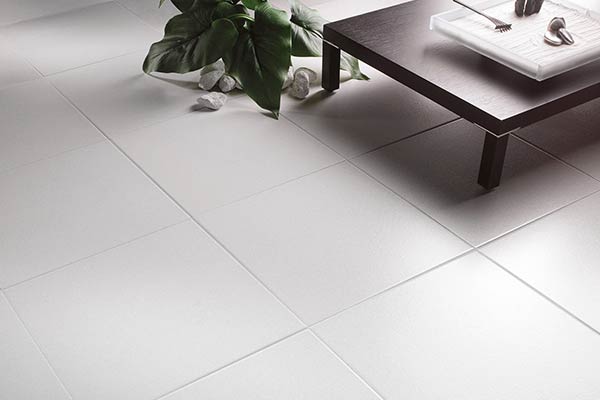
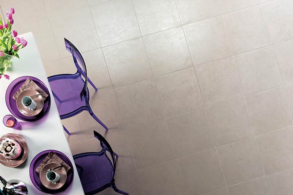
White porcelain stoneware tiles: a harmonious decorating touch
The white tile is defined as a major asset in decoration, and this is due in particular to the neutrality of its hue. In fact, its nature gives rise to an infinite field of creativity and the decorative possibilities are endless.
For lovers of a refined style, you can opt for the elegant look of all-white. Paired with white decor, white tiles and their subtle shades, with a matt or gloss finish, create a cameo of whites from floor to ceiling, and the aesthetic appeal of white matt tiles is simply hip. For others who may feel that this ‘total look’ ambience is more sterile, it is advisable to combine white stoneware with warm decorative elements, such as wood. In this case, the decorating style takes on Scandinavian accents and admirably embodies the ‘chalet’ spirit.
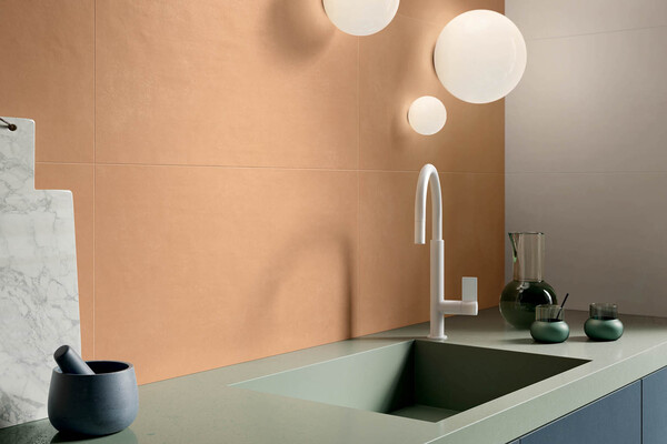
White porcelain stoneware brings supreme refinement and can also blend in with more contemporary and modern styles. In industrial or trendy interiors, the luminous hue of white tiles uses its multiple nuances to highlight the elements and materials that make up the room’s identity. Finally, the strong point of white tiles is that they can be easily combined with any space. For example, they can be chosen as a floor covering, giving you the option of opting for a brighter shade on the walls. The clarity of white stoneware blends harmoniously with all the colours it is combined with: among them, it is easy to use to contrast with black for a more graphic result, with a warm colour like red or orange shades for a colourful result, or with a darker colour like duck blue that gives life to a relaxing and soothing atmosphere.
As a result, it’s clear that the white porcelain stoneware tile is a model of flawless sobriety. It helps to harmonise your indoor and outdoor spaces while giving them a certain timeless and, above all, luminous cachet.
Good to know: White has the highest Light Reflectance Value (LRV) of any color, meaning it reflects up to 85% of natural and artificial light. This makes white tiles the ultimate architectural tool for visually expanding small or dark rooms. However, to prevent a space from feeling “sterile” or “clinical,” the secret lies in the grout. For walls, matching white tiles with a slightly contrasting light-grey or warm-beige grout highlights the shape of the tiles, adding subtle structure. On floors, we recommend avoiding pure white grout,which is highly prone to showing dirt, and opting instead for silver-grey or jasmine-toned grouts, which look cleaner and last much longer.
Not Just “Plain White”: Explore the Aesthetics
Far from being basic, white is a complex color that changes dramatically depending on its temperature, finish, and texture. Here is how to choose the right one for your style:
- Warm vs. Cool Whites: Cool whites (featuring subtle blue or pale grey undertones) create a crisp, ultra-modern, and clinical-clean aesthetic. Warm whites (infused with soft ivory, cream, or milk tones) are far more welcoming, making them perfect for cozy living areas or rustic modern kitchens.
- Glossy vs. Matte Finishes: Glossy white tiles act like mirrors, reflecting light dynamically to brighten dim bathrooms and splashbacks. Matte white tiles, on the other hand, absorb light softly, delivering a velvety, understated, and highly contemporary tactile feel that is perfect for floors.
What can white sandstone be used for?
White porcelain stoneware tiles can be used for flooring, but can also be laid on walls. Traditionally reserved for the bathroom or kitchen to brighten up the room, white tiles can also be adapted to other indoor and outdoor spaces.
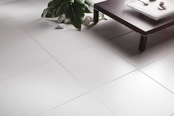
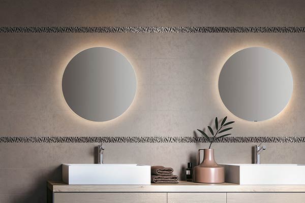
It’s essential to point out that white tile has the technical properties of porcelain stoneware and therefore has many advantages depending on its intended use. Firstly, its high resistance to water and steam makes it the ideal covering for bathrooms and kitchens. What’s more, the luminosity provided by white sandstone gives an immediate feeling of cleanliness.
Of course, white porcelain stoneware is a wise choice for the living room, where it brings out the natural light to create a light, friendly atmosphere. What’s more, white porcelain stoneware tiles are highly resistant to wear and scratches, making them perfectly suited to living room floors that often witness heavy footfall.
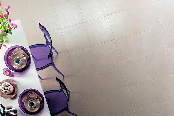
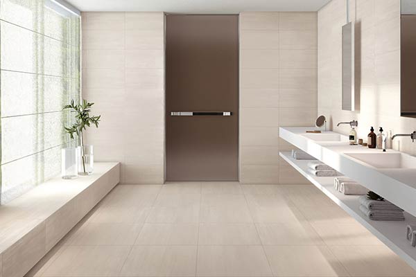
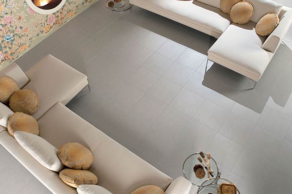
White tiles can also be laid in outdoor environments because they are not affected by frost or bad weather, and both on walls and floors when they have the necessary anti-slip properties. In this way, white tiles are even suitable for use around your swimming pool. Another advantage not to be forgotten is that the aesthetic appearance of white stoneware is not affected by the effects of the sun. Ultraviolet rays neither lighten nor darken its surface. This way, you can enjoy your garden and terrace in a fresh, light atmosphere.
| Target Area | Recommended Tile Type | Technical & Design Benefit |
|---|---|---|
| Bathroom Walls | Glossy or 3D Textured (e.g., 30×60 cm or 40×80 cm) | Bounces artificial light to make small bathrooms feel larger; incredibly easy to wipe clean of soap residue. |
| Kitchen Splashback | Glossy Metro or Small Format | Non-porous glazed surface acts as an impervious barrier against grease, pasta sauce, and steam. |
| Living Room Floor | Matte Large-Format (80×80 or 120×120 cm) | Large slabs minimize grout lines for a seamless, continuous look that feels minimalist, airy, and high-end. |
White tiles: what formats are available?
The white sandstone brings to life many creations that are different every time, thanks in particular to its luminous and discreet colour. In addition to its versatile nature, white porcelain stoneware tiles are available in a wide range of formats. All sizes are designed for different sized spaces, but everyone can benefit from the clean identity of white porcelain stoneware. There are many choices to choose from:
- White porcelain stoneware in small sizes, including 20×20 cm and 30×30 cm, among others. These sizes are particularly suitable for use as bathroom tiles or kitchen splashbacks. These two options protect the walls from damp and greasy splashes. The white 20×20 tiles add a touch of freshness and instantly instil a bright atmosphere.
- Medium-format white tiles feature measurements such as 45×45 cm or 60×60 cm. These sizes are chosen for many places because they are able to enhance them, regardless of their size. This format of white porcelain stoneware is therefore suitable for all rooms, offering a soothing, uncluttered result.
Large format white porcelain stoneware tiles including 120×120 cm. These sizes are mainly recommended for large rooms because they are lighter and visually enlarge the space. The grout lines are reduced and the aesthetic result is less busy. White tiles, in this case, reinforce this characteristic thanks to their luminous, soothing colour.
White porcelain stoneware: frequently asked questions
What colour scheme to choose for white tiles?
The main advantage of white stoneware is that its luminous shades are neutral and adapt to any decor. Its finishes also have undeniable decorative power and glossy white tiles, for example, enhance the room’s natural light. Combined with dark colours such as black or anthracite, it creates a contemporary, industrial atmosphere that is designed to enhance any decorative object. On the other hand, combined with warm colours and materials such as wood, white porcelain stoneware gives life to a soothing Scandinavian decor.
How do I clean white tiles?
Cleaning white porcelain stoneware is quick and easy, an undeniable advantage in everyday life. All you need to clean it is hot water and a cloth. Given the low porosity of white stoneware, stains remain on the surface and are easily removed. If they do become embedded, a professional brand product can be used, as stoneware is highly resistant to chemical agents.
Can white tiles be laid outside?
White porcelain stoneware tiles are suitable for installation in outdoor environments, both on walls and floors. White porcelain stoneware has excellent anti-slip properties, making it ideal for use around swimming pools. It is also frost and weather resistant.